20 years ago to this day, I published my 51 Half-Life Editing Tips onto the Valve ERC. It contained 51 nuggets of advice for keen level designers who were new to making Half-Life maps.
What the article didn’t mention is that I, too, was new to making Half-Life maps; Half-Life itself had only been released a few months prior and, at 16, I certainly didn’t have quite enough experience to be claiming any authority over how to make maps as good as the professionals.
Subsequently, many of the tips were useless, and others were flawed or plain wrong.
So without further adieu, it feels about time to issue some corrections and clarifications regarding the tips contained therein lest an ambivalent alien race descends upon us and determines our fate based based on a severely dated article that’s only available via the Archive.org Wayback Machine if you know exactly what to search for.
Tip #9
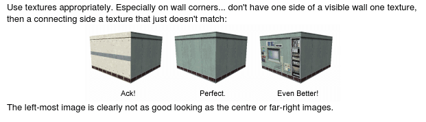
Use textures appropriately. Especially on wall corners… don’t have one side of a visible wall one texture, then a connecting side a texture that just doesn’t match.
Good advice, but only for walls, really. The original Half-Life campaign contains many violations of this tip, to good effect.
Tip #15
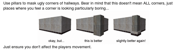
Use pillars to mask ugly corners of hallways. Bear in mind that this doesn’t mean ALL corners, just places where you feel a corner is looking particularly boring…
This would be better advice were it not for the horrific example pictured on the right-hand side of associated screenshot. I really don’t know what I was thinking with and wish to extend my apologies to anyone who adopted the pictured geometry and texture choice in their own maps.
Just like in real life, clean, unobstructed corners of walls are generally preferable in most cases - and this is especially true in fast-paced multiplayer maps. Don’t do what I did in the picture.
Tip #21
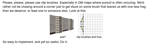
Please, please, please use clip brushes. Especially in DM maps where pursuit is often occuring. We’d rather not be chasing around a corner just to get stuck on some brush that leaves us with one less frag than we deserve, or feed one to someone else.
Of course, clip brushes are fantastic. Use them. They (and their modern equivalents) are even more relevant today than they ever were.
However, this advice falls down on the example in the screenshot, which shows two separate wedge-shaped brushes either side of the support - it would be preferable to use just one brush. I should have just duplicated that pillar brush, flared out the edges touching the wall so it becomes a trapezoid, and assigned the CLIP texture. This would result in the same profile as the screenshot, but vastly improve the quality of the resulting collision mesh.
Tip #37
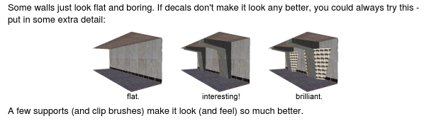
Some walls just look flat and boring. If decals don’t make it look any better, you could always try this - put in some extra detail. A few supports (and clip brushes) make it look (and feel) so much better.
Bad advice based on the screenshot which shows walls that slope inward towards the top. Anyone who’s played multiplayer maps with such walls know how easy it is to get caught on them as the player’s collision box gets wedged between the ground plane and the sloped wall.
So, while the screenshots show clip brushes expertly tapered and cut to perfectly match the wall, demonstrating my absolute mastery of brush manipulation at the time, I was advocating a result that was arguably much, much worse than having no clip brushes at all.
The correct clip brush usage here would be a trapezoid like in tip #21, with faces that are parallel to the wall (i.e straight up/down), rather than sloped the same angle as the supports. This ensures the player’s collision box easily slides past the clipping hull.
Tip #45
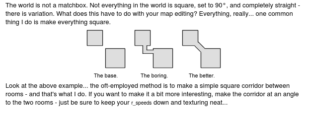
The world is not a matchbox. Not everything in the world is square, set to 90°, and completely straight - there is variation. What does this have to do with your map editing? Everything, really… one common thing I do is make everything square. The oft-employed method is to make a simple square corridor between rooms - and that’s what I do. If you want to make it a bit more interesting, make the corridor at an angle to the two rooms - just be sure to keep your r_speeds down and texturing neat…
Acceptable advice, but has to be employed correctly. ‘Dog-leg’ corridors connecting rooms often designed specifically to reduce lines of sight and draw distances, which this advice conveniently ignores.
Conceptually, two rooms connected directly in the third example pictured are, in my head at least, pretty much the same room. From a gameplay perspective, that diagonal corridor doesn’t distinguish the rooms well enough.
Tip #49
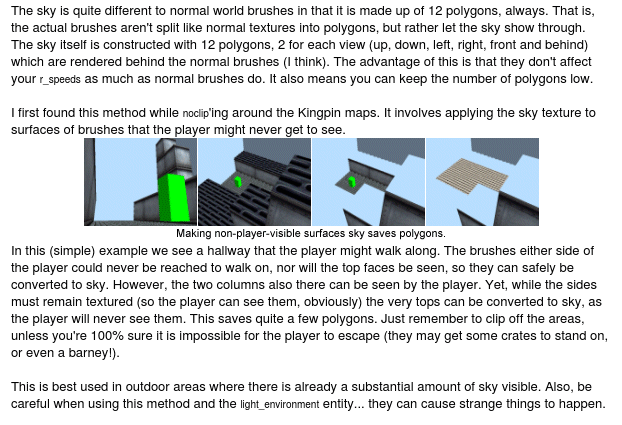
I first found this method while noclip’ing around the Kingpin maps. It involves applying the sky texture to surfaces of brushes that the player might never get to see.
These days you really should be using the NODRAW texture rather than SKY.
However in modern multiplayer games you actually want to ignore this advice - many of these these ‘hidden’ surfaces are now rendered and even decorated for the benefit of spectators. (You should still hide surfaces that neither players nor spectators need to see, though.)
Tip #52
This tip didn’t exist at the time, but if it did, it would be to spend more time playing the original Half-Life campaign on the recently-released Sven Coop because a) it’s fun, b) it’s awe-inspiring seeing how the original maps were stitched together so seamlessly, and b) you can pretend you’re actually doing research for the thrilling sequel to ETC2 your next Half-Life map.