Introduction
Back in January 2004 I told someone I had no plans to make any more Counter-Strike maps. None. Nada. I hadn’t released a new map for over a year, and only recently made some changes to Cobble. A new map from me? No chance.
I’d had my moment, and it was time to move on to something new, something fresh, something I could really sink my level designing teeth into - like Half-Life 2 perhaps… my Counter-Strike mapping days were over. Hurrah!
From: David Johnston
To: Jess Cliffe
Sent: Friday, January 23, 2004 2:22 PM
Subject: Also...Just curious really... Do you need any more maps for 1.6? My exams finish in 13 hours time and I could probably create a new one over the next month or so. I haven’t mapped for ages...
Dave
Oops.
From: Jess Cliffe
To: David Johnston
Sent: Saturday, January 24, 2004 1:25 AM
Subject: RE: Also...A new DaveJ map for 1.6 – now you’re talking...
In May that year, my new Counter-Strike: Condition Zero map, Sienna, went live.
Bugger.
Fortunately, despite hugely denting my own self-discipline, it turned out well. Throughout production of Sienna (or ‘Aldea’ as it was originally named), I kept track of the map, such that by the end I had a large number of files that I could go back to so I could see how I developed it. Then I could tell all…
Work started the day after my last University exams in January. Work continued through the second semester, alongside my studies, and finished shortly before the second set of exams.
So, I had a week of emptiness in which to let my imagination run riot, with the aim of perhaps ending up with a CS map that plays as well as people expect from modern-day CS. With a deserted mind and a full week to get started, I set to work…
Theme Establishment
The first steps towards creating Aldea involved establishing a theme. In Aldea’s case, I didn’t actually know what I was going to create, and only had a rough idea of the style I was going to go for. However, I did know that it had to be a very flexible theme, such that I could squeeze it onto bizarre or odd geometry or areas and still have it look good. The easiest way for me to do this was to create a new theme without a basis on any real style or location, but blend in some common features in order to maintain some form of atmosphere.
In this case, I simply opened up my editor of choice - Paint Shop Pro 8 - and started putting things together. A window from here, some bricks from here, some nice plaster-ish pattern from there - mix them all together in a large jug and bake for 30 minutes.
Generally this involves creating a basic background (consisting of a few layers), and then adding basic items features on top (like windows or doors) in order to create a themed set of textures sharing similar characteristics. This gives me a limited set of basic textures with which I can experiment. (As a side note, all the textures are created twice as large as the size they’ll be used in-game, but in Hammer all I did was set the texture scale to 0.5 as a small experiment, making the textures look more detailed)
The results of my first experimentation session show quite severe blockiness and a really bizarre choice of geometry - there are some weird angles on the buildings (what I really hate is how those sloped walls have windows - and my taste is to always keep windows vertical). That said, I was quite fond of the browns and the reds, but the geometry and architecture was awful. It consisted of nice clean lines, and just felt so 2001… forced together for no reason other than ‘I want to make a map’.
In any respect, this first attempt demonstrated that the textures were nasty, my imagination was broken, and that I’d need to try again. It was not working. Fortunately, this was normal.
Now the ball was rolling… a theme was slowly springing up from a very basic set of textures. In creating this area I had three maps in my mind - Romania (007:Nightfire), Tides (CS:CZ) and Italy (CS). This was really still tinkering with ideas, which generally involves creating these sorts of areas just for the sake of creating them (without any intention of actually using them). It was still too ‘blocky’ though, due to the textures I was using. It felt better than the first attempt, but still utterly pathetic.
A few years ago, had I been doing this same exercise, I would have given up now. I’d tried and failed. But we get more experienced, and we learn. Since then I had learnt the importance of this process. So far, I have spoken about what comes to about 8-14 hours of time, just playing with ideas and working out what works. If it had worked brilliantly, I would have continued and probably created a full map. But it was not working well at all. It’s all part of the process, which for me is usually an iterative process, where a map is built up and up and up, working with a vision of what’s to come, but not looking too far ahead (because ideas and problems always change). It is a process of continual improvement and testing. Things rarely end up exactly as planned, and in most cases it is for the better.
The important part of this process was to establish some ideas, get my imagination working, and test out some environment ‘widgets’ - such as how the textures fit together to build basic buildings, windows and doors.
Theme Establishment 2
Sometimes it’s just better to go back, and try again.
That’s not to say I had abandoned what was already done - far from it. The initial experience gave lots of resources in terms of basic textures, theme ideas and suggestions for what to try next. Knowing what worked and did not work, I could try something new.
I then proceeded to spend another few hours working on some new textures. I had already established that I liked the brown hues I had before, but by themselves they were creating a very uniform look. I needed more variety, so I took a leaf from Dust’s book and created a more ‘sandy’ texture set, which I love because they’re so versatile. I kept the roof textures from TFC because, simply put, I think they’re great.
Finally, I was getting somewhere. The textures felt good, they fitted together nicely, and some fairly varied architecture was possible. It still felt a little ‘fake’, but it was still early days.
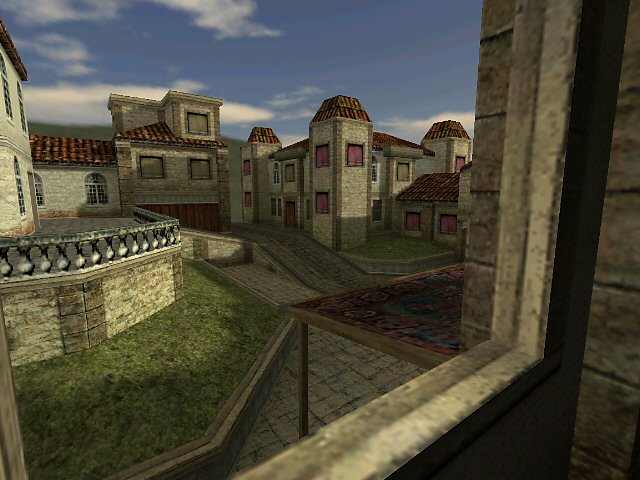
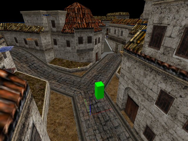
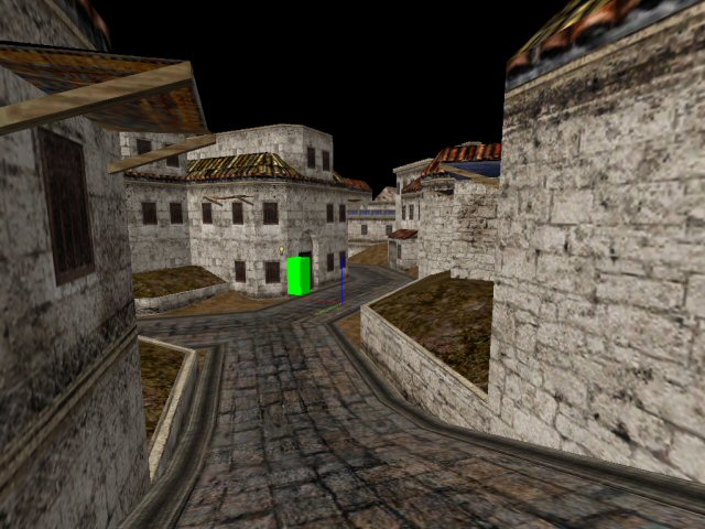
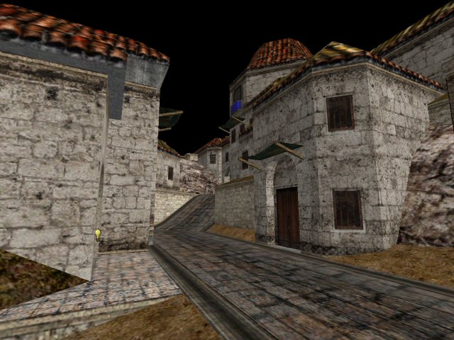
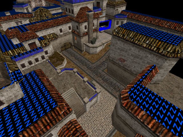
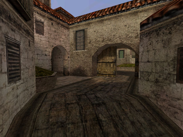
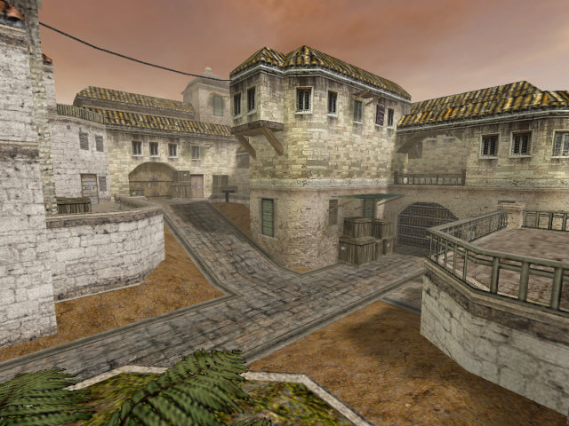
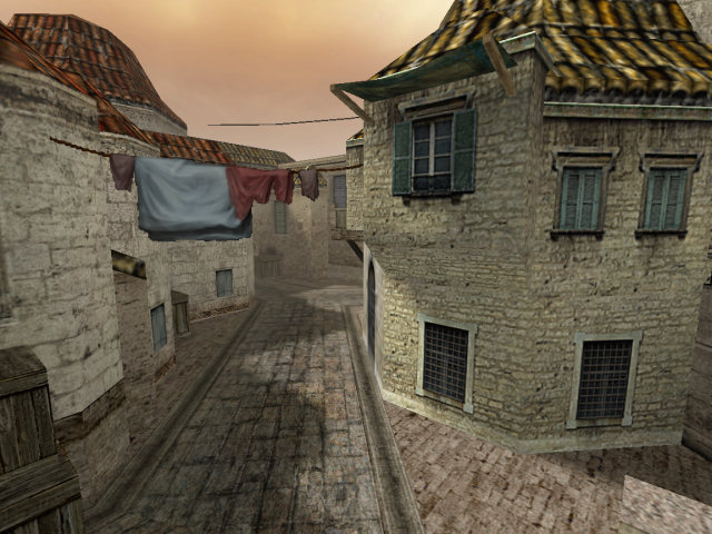
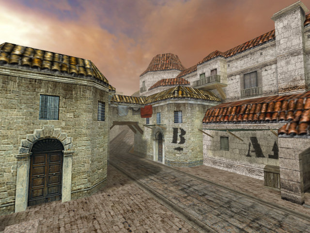
While creating this area, I had Italy’s CS start stuck in my mind - and the ‘fork’ that it presents to players. You’ll see I copied it here, and on the right hand side it even presents two options - to dart to the right, or to go to higher ground (just like in Italy). I really don’t like it when I cannot shake map layouts from my head, but in this case it may have helped me establish the theme. Even then, you’ll see this basic area layout stayed until the very end… (as another side note, the ill-fitting brown door in these screen shots is actually nabbed from the side of Hartley Library at my university, and the original image is somewhere on this site).
One important of this experiment was to leave the grid - a problem that plagued my first attempts was their ‘blockiness’, partly because the textures were evil, and I stuck to the neat 32 and 64 grid lines. In this attempt, I intentionally threw in some bizarre angles while trying to maintain cleanliness with the brushes. I also added in some passive details (things that don’t affect game play at all but really affect the atmosphere/architecture), such as the strange outposts on top of the buildings. This also heralded the creation of the curved roofs (featuring a nipple each), for which Levelord may take the blame (read: credit).
That said, I couldn’t even use what I had created here. It was high polycount (or was heading that way), used textures I didn’t want to use, and gave me bad vibes. ‘Vibes’, instinct and intuition are everything to me when designing maps. I now had something to work on and aim for. To an extent, it would be non-achievable.
For the purposes of making my life easier, the progress of Aldea is going to be presented chronologically, which should also give the benefit of showing why features changed and how development actually progressed.
Week 1
It’s nearly always the case that creating the map gets off to a really good start. Your head is full of ideas and you just want to get to work and create something.
Wednesday, 4th February, 2004
If I remember correctly, it only took a couple of days to get this far, but then the fork is still present, and the rest of the map is very generic. It seems that at this stage, I was still in experimentation mode, still trying to understand how best to use the textures to create an environment that looks and feels ‘right’.
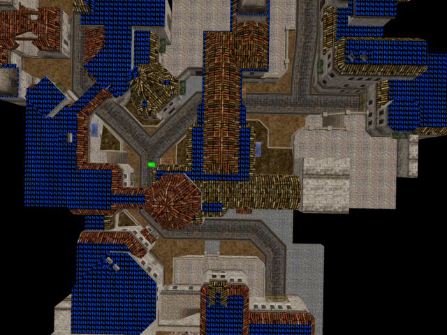
You can see that the whole map is really on one flat plane - there is little deviation in heights. At this stage, the map is merely serving as a hub to try new things and establish a layout I’m comfortable with.
Already there are similarities to Sienna - the fork and the stairs on the right-hand path are there, as is the platform facing site A (above the selected brush in red). There is also a tunnel to the left of the select brush, which in Sienna, is blocked by gates (I’ll come back to this later).
Friday, 6th February, 2004
Very little changed at this point. The main feature I was experimenting with was a balcony looking up to the left-hand side of the fork, a route I already knew would be important since it is the first thing a player would see as they turn into it (have a look at the overview from Wednesday). I also had to consider the line of sight - it’s a very long distance (notice the view in the screen shot on the left) - which did not feel right at all. For TFC it may have worked, but not CS (this one decision may have been a turning point in the whole game play of the map, but I’ll come back to that later)
Saturday, 7th February, 2004
I didn’t stay with the balcony idea for long, and as you can see in the shot of the fork, put an archway across the opening to the fork such that the view from the balcony would be obscured. For some reason, I also made a little house, broken into pieces… that didn’t last. I have a feeling I was bored and lacking ideas at this point.
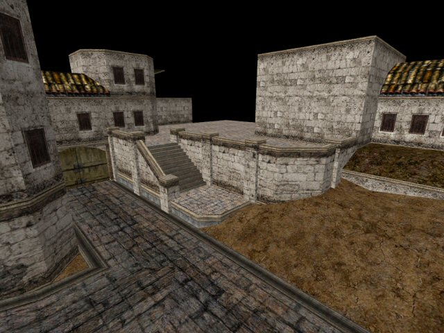
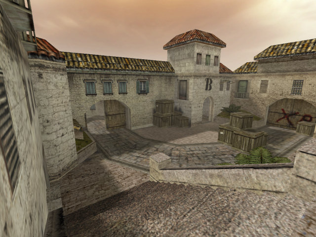
Check out bomb site A - at this stage it has a couple of platforms separated by the road, and they don’t really go anywhere. You can also make out the tunnel. This area felt like it had value, which is why I kept its basic design and changed its surrounding structure. It feels quite large and open.
Week 2
Monday, 9th February, 2004
Having now got bored of the fork, I moved back to site A to do a little work. I was still puzzled with what to do here, and merely just trying ideas as they came to me. (This is not how maps should be made… ideally there should always be something that can be done - which is why pre-planning is so important, even if consists of just a few sketches.)
However I did know that this would have to lead all the way round to the fork entrance, and that a team would start along that path somewhere. This was why I was spending most of my time on these two areas - because in all likelihood, they would be the first points of sight and conflict. Of course, I still didn’t quite know what type of map I was making…
Saturday, 14th February, 2004
This was the result of five days work, from Monday.
The main changes are near the Terrorist start (which I think was actually going to be a CT start), which has finally looped round to join the fork and site A. The tight corner into the fork was necessary to lower the view distance and conserve some polygons (for better performance), as well as act like a choke-point. You can also see how site A suddenly comes to life.
The reason for the sudden burst in progress was down to one thing - height. It occurred to me on the Monday or Tuesday night that the map severely lacked height differential, and that adding it in would not only present new ideas, but give the map some variety, some life, and give me more room to play. It did exactly that. I had Avanti (a TFC map) and Avalanche (DOD) running through my head every step of the way.
One of the more interesting/tricky developments in Aldea involved (what became) site A. At this point, I had just got the T-spawn up to speed, and hence had some material to work on. With Avanti still in my head, I felt that maybe I could create a passageway from the site A platform overlooking the area of the T-spawn. It would probably be quite fun…
Alas, it did not suit the map. Firstly, the area it overlooked would need extra detail to make the view look reasonable (due to extraneous surfaces being removed). Secondly, the idea of a dead-end or a one-way passage did not excite me - and there was no way I wanted to try and squeeze some more stairs leading up to that area. It would simply be a repeat of an existing route, adding unnecessary complexity.
We can see that the T-spawn upper platform originates from around this time, but it lacks a few things, namely the tunnel between each half of the gate, and the windows above the gate. This area proved quite tricky, again due to the view distances and the requirement of low polygon complexity. The main problem was being able to see so far from the top of the stairs at site A. I could not see how I could possibly add any more to this area with that problem still present.
If you look closely at the picture of the ramp, you will also see how the ramp is split into three sections. A pet peeve of mine are the ramps in Dust and Cobble, which go from horizontal to about 30deg back to horizontal - any car going up those slopes would get beached at the top! In Aldea, initially at least, I tried to curve the ramps a bit more… which looked a lot better as well. (Fortunately, with the Source engine, we can afford to do this from now on and not worry so much about polygons)
Week 3
Sunday, 15th February, 2004
Returning to site A once again, finally it was time to kick some life into this area. By now it was time to stop trying new things and instead go back to basics - enclose the area and grow out of it (rather than the opposite, which is what I was doing before). I added an arch to the top of the ramp, enclosed a small platform to the side, and gave myself something to work on.
That said, this was not a very productive day. The only other changes were small refinements to the T-spawn area as I worked out what to do. Notice the ‘ground’ texture on top of the brush to the right. Bad texture choice.
At this point, site A suddenly becomes tighter than it was before - less open and less room to manoeuvre, hide, or do anything clever like you could do at - for example - the bomb sites in Dust. Of course, at this point, it was not officially a bomb spot.
The problem, sometimes, is that it’s easy to get caught up with one area of a map - you struggle to work out what to do. This happens to me all the time. Years ago I would have tried to force myself to think of something - but that never works. I realise I’ve since started to just ignore the mental block and toy with minor things instead of looking for the solution.
For example, if I’ve got a complete mental block and I can’t think of anything new, I’ll go back to something I’ve done already and work on small improvements. I’ll forget all about what I need to do. This seems to clear my mind and usually - although not always - an idea will pop into my head and slowly mature until I’m ready to try it out.
One problem that occurred to me around this time involved the stairs at the T-spawn area. It was possible to simply see too far up (or down) them. Someone crouched at the bottom of the stairs could almost see the ramp. I find it a bad idea in such a tight area for such views to be possible (think sniping), not least because it strikes me as untidy. Secondly, if such views are possible, then the likelihood is that view is going to suffer from above-normal polygon counts.
Thursday, 19th February, 2004
About time to start making progress on the CT spawn area. It was fairly obvious that the roads round the map should meet, so the CT spawn area seemed like a good choice.
However, this did not feel right at all. Not in the slightest. I felt maybe the emptiness made me feel uneasy about it. Maybe it felt too simple for it to work. Perhaps it was too obvious. On the other hand, it would have fitted with the theme - it could have created some sort of high street.
Whatever it was, I was rapidly losing confidence in not just the CT spawn area, but the map as a whole, and indeed starting to have doubts whether I could finish what I had started. Very serious doubts.
(Even now, looking at these screen shots, I feel very uneasy and not at all happy with the map.)
Week 4
Sunday, 22nd February, 2004
At this point, with Avanti still stuck in my head, I was starting to think about creating a hostage rescue map. It seemed good - the CTs would need to clamber uphill towards fortified buildings that the Terrorists were holding the hostages in. The longish views (through site A and B), and the short path through the middle meant that it would mirror Italy somewhat.
This urged me to work more on extending the map rather than fixing what I had already done. Having looped the road round, I’d now need some buildings or something to make it feel real and to give the place some real game play. Right now, I just wanted to get it done.
Tuesday, 24th February, 2004
The main problem with building this as a hostage map was that site A would be the focus since this is where the teams would most likely first meet en masse - not the hostage area. The emptiness of the area didn’t help either, exactly for this reason. But I carried on.
Wednesday, 25th February, 2004
Finally I realised that making this a hostage map was not going to work. One indicator was that it was proving very difficult, and the second were the polycounts which were likely to be high due to the arrangement of the buildings. The latter issue meant I was building worse and worse structures (game play-wise), creating tight areas were game play should really have been quite open.
With still no ideas about an alternative, I went back to work on the fork - another area (which later became site B) that had been giving me issues because it too gave a very long view. Hence I stuck a mammoth wall in the wall at the top of the fork, and - struggling for ideas - added a small balcony. It helped little - the smaller area became problematic. I wanted to keep an urban-type feel, but the ground was better suited as sand, and it the whole area felt like it had been forced into place, which in all truth, it had been.
Thursday, 26th February, 2004
I realised that the fork was not being helped by the fact that it went either directly into site A, or directly towards (what would become) site B. The balcony on the other side of the fork (in the centre of the map) could not be good - it seemed like it would be a far too advantageous defence position, especially considering the arrangement of the rest of the map (remember there was a tunnel from the fork to site A).
But then again, I had tried to fit stairs here already and they came out looking a mess.
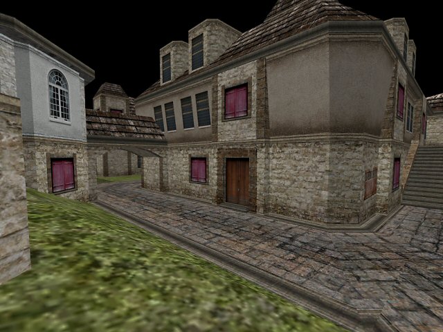
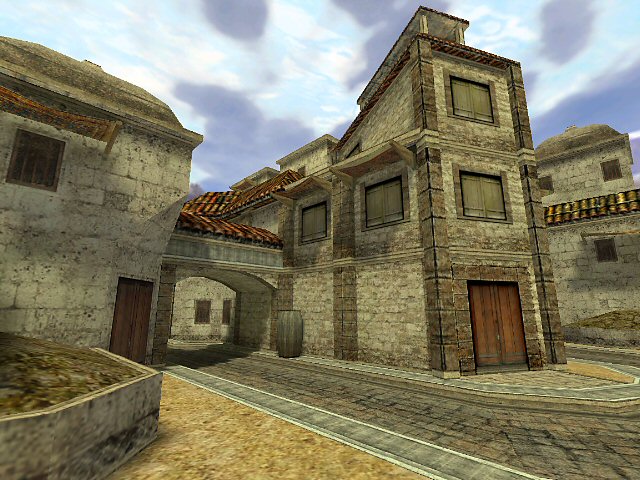
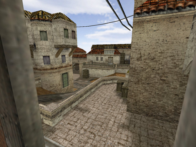
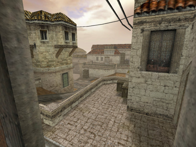
I tried again, as an experiment. They looked alright. Realising this area was now too open, I blocked the tunnel with a door. I then added a passageway through the building. I became more comfortable with it. With the map compiled and the sun shining, the rays of light bursting through those windows onto the checkered floor looked great!
Somehow, that small detail resurrected my belief in the map. I returned to site A, undid the loop I had made just days before, and set to work transforming it to make use of the new central layout. I extended the platform. I added a balcony. I blocked off the gate at the top of the ramp. All in a few hours of pure mapping energy. I don’t remember doing much but hacking away at the map that evening… (my housemates - doctors - feared for my life, and my back, eyes, nutrition, wrists…)
Week 5
Tuesday, 2nd March, 2004
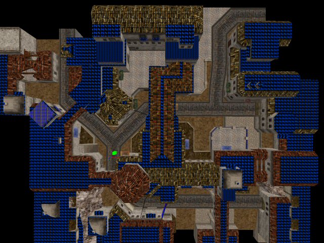
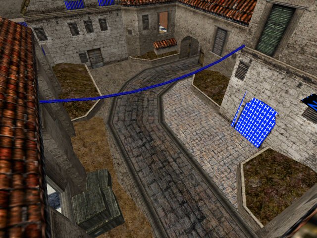
Finally we can see that the final layout for Sienna originated around this point, at least with regards to the very basic organisation of flow around the map. In the days just before this I had spent a little time adding small details to the map such as overhead cables, tidying up some of the buildings and generally making the map more presentable…
Friday, 5th March, 2004
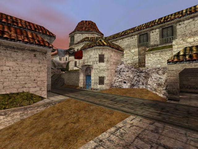
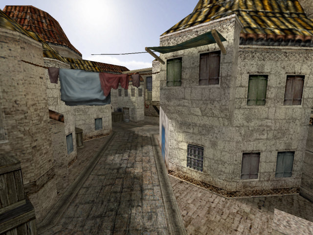
One thing I’m not keen on is boring, uniform skylines. Adding some variety with height, and then shape changes as perspective moves all helps give a greater sense of the environment to the player. It emphasises that this is a three-dimensional world. This is not Mario. The T-spawn initially looked rather empty in this department, since the roofs were just about the eye line, if viewing from the top of the steps. Changing the roof heights a little, and adding the sharp edges of the rock helped break this up. In the real world, rock typically doesn’t fit next to brick like that, but CS is better than the real world.
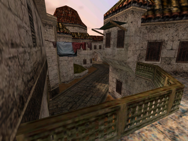
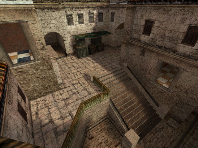
Similarly, the crates in the corner of the railing were also placed there to break up the line of the rail, and add some cover if there is a battle in this area.
Week 6
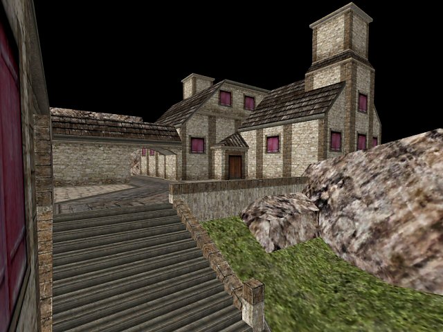
Monday, 15th March, 2004
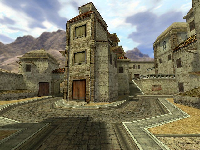
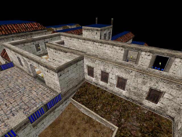
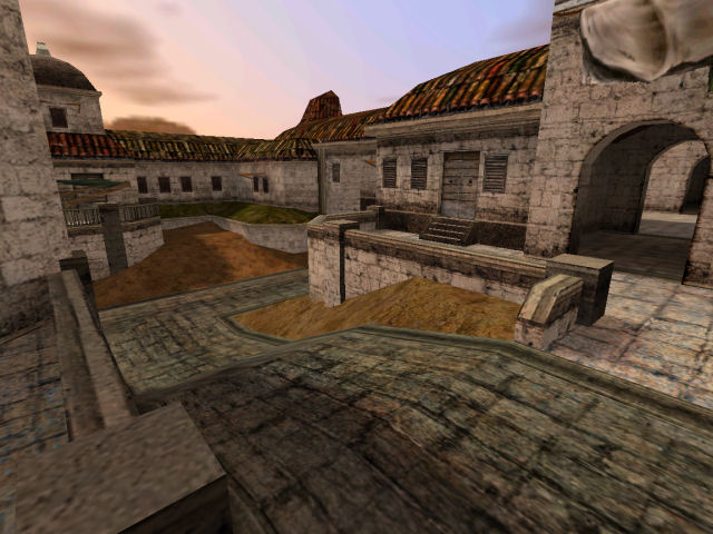
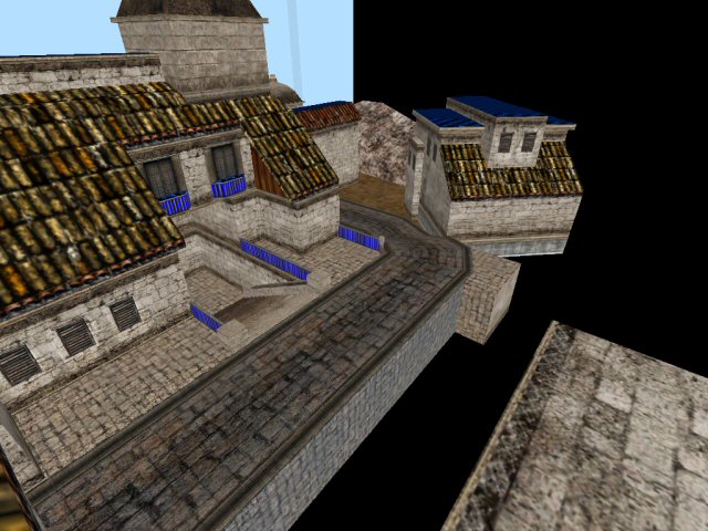
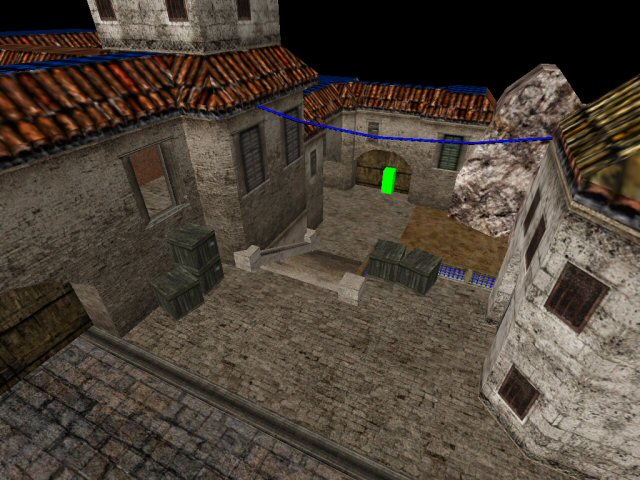
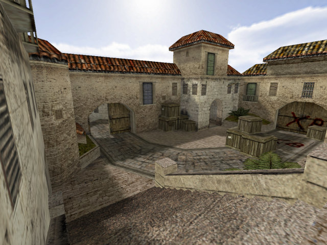
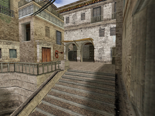
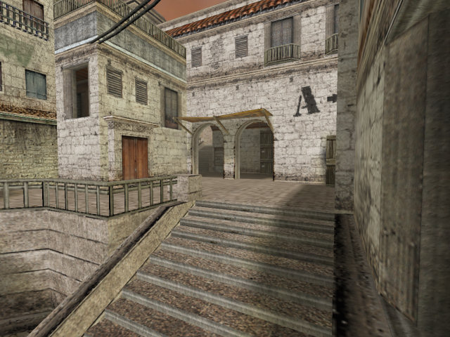
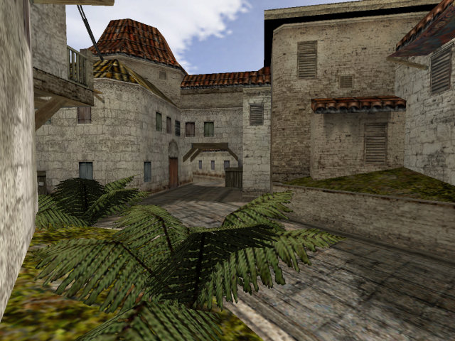
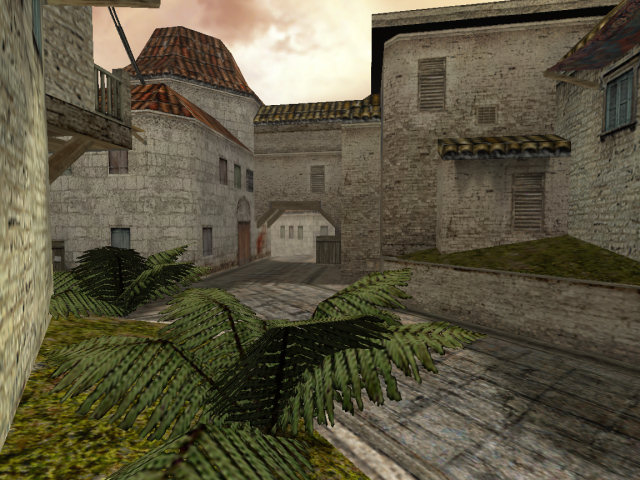
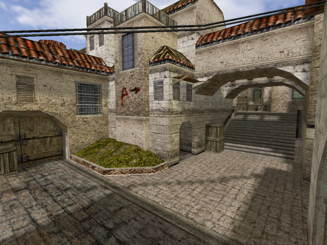
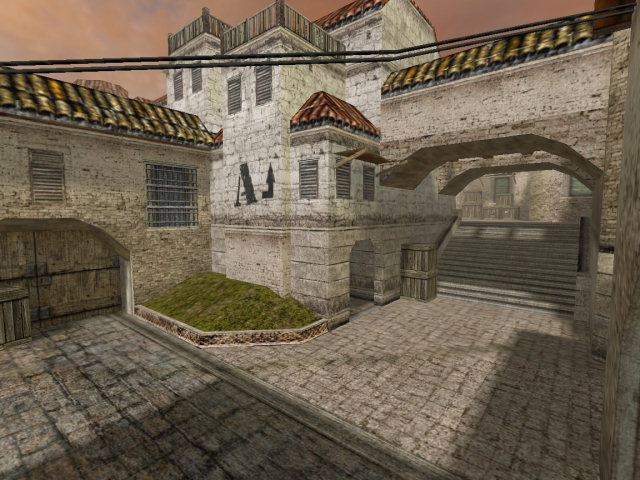
These pictures show the closing stages as Sienna nears completion - all that remains is to finish off the CT-spawn, followed by routine testing and maintenance. You’ll note that Site A and Site B are suddenly finished - caused by a sudden influx of ideas and energy! The windows from Site B were something I’ve been wanting to put in a map for years, and after using them in Nightfire, really wanted to use them again. Yes, they’re just windows, but they have a certain charm, despite simply being holes. I like the thought of seeing players appear in and out of sight as they run behind them, plus the harsh shadows they can create. The sunlight of the map was actually angled specifically to capture light coming through these windows, otherwise they would look dull and make the hallway a camping ground.
Site B was a nightmare to create. The fork leading up to it meant there were lots of polygons on show, and somehow I had to make passage into the area quick, easy, and yet keep it enclosed. Polygons were shaved here and there, brushes moved and replaced, hint brushes placed everywhere that helped. I’m not too comfortable with the area, but it turned out ok. Typically, I enjoy keeping these things simple and easy - because otherwise it can cost hours later on (same goes for graphics, HTML, programming… everything!).
Thursday, 18th March, 2004
From this point forward, the focus would be on completing the map then subsequently tidying up, fixing up appearances, and getting the map just right and ready for release. Cliffe had a beta version of the map, who promptly gave me this reply:
From: Jess Cliffe
To: David Johnston
Sent: Thursday, March 18, 2004 1:03 AM
Subject: RE: Also...d@ve,
Took a look at the map and played with bots on it for a good while. First off, I think it’s fantastic, once again great work. Here is my feedback:* Lighting is a little dark, I’d make it hot and sunshiny
* Balcony looking down at bombsite B I’d make stares to increase playflow
* I’d move bombsite A: see the T in the brick road next to present day bombsite A? Well take that road uphill a bit to the door. I’d put it around there and then make this area a bit more open to make bomb defending interesting.
- A lot of main routes feel cramped and narrow – I’d widen these by 1.5 or so.
I really love how small it is (in total volume) – plenty of action.
Let me know your thoughts,
Cliffe
Cliffe was also responsible for bomb placement in both Dust 1 and 2, and their game play owe a lot to him. Cliffe is a man to be trusted when it comes to CS maps (and also appears to lose his forename quite often around here).
My reply, merely for completeness:
From: David Johnston
To: Jess Cliffe
Sent: Thursday, March 18, 2004 3:14 AM
Subject: RE: Also...1. The lighting is something I’ve been tweaking. It’s about 75% the brightness of Dust - I’ll try taking it all the way up, maybe add more yellowish to it (it’s a bit peachy atm).
2. I only made that balcony a balcony cos I couldn’t make stairs look good there. 2nd time round maybe I can!
3. That’s a good plan. Would also help make the scnario more interesting if I moved B closer to its door - i dunno, “a rogue group of spainiards are trying to gain access to the town centre but need to blow one of these two doors down”
4. This could be difficult. Some of the pathways are that thin to keep r_speeds low. The path from T-start to A could prolly be widened reasonably easily, but their other route (towards the fork) might be more trouble, as would be the route from there into B. The opening at the top of the stairs in the fork (leading to the corridor to the CT-start) could probably cope a widening. I’ll see what I can manage.Dave
To this day, I still don’t think the lighting in Aldea is quite right. Maybe it’s because I’m so stuck in my Dust-like ways that I can’t accept anything darker. I actually think it has more to do with my textures - they’re far less saturated than the ones that MacMan did for Dust, and hence feel a lot duller. Thankfully this was exploited and hence when the map was released as Sienna, it had a dirty, foggy, overcast feeling to it.
One of the interesting developments in Sienna was the placement of the Site B bomb spot. As I originally designed it, this was placed on the platform - intentionally exposed to the three possible places the CTs could appear from, yet easy to access for the Terrorists. It would encourage the requirement for Terrorists to work as a team and hold down the area effectively.
On the other hand, it was very close to the Terrorist start, and a rushing team can easily get to it, plant the bomb, and win. It also had little mission objective value - why are they trying to blow up a small patch of concrete?
As per Cliffe’s suggestion (remember, he helped me place the Dust and Dust 2 bomb spots!) I moved them, and in my own testing, they were just as fun. Alas, it would mean I had yet to make a defusion map with my own choice of bomb spots, but it’s the game play that’s important, not me.
From: David Johnston
To: Jess Cliffe
Sent: Monday, March 22, 2004 12:13 PM
Subject: RE: Blah blah etc.Spent w/e w/ housemates trying to think up a new name - didn’t think of anything. Any ideas yourself?
Attached is the latest version, with changes as you mention. Widened up a few bits. Tried the ‘B’ route, but had no luck without hitting polycount problems.
The sky is changed too - a nice bluish now, which actually makes more difference than adjusting the lighting did. I’m thinking maybe a custom sky is needed, but I’m not skilled enough to do that. Maybe the current one will do?
Dave
What an annoying housemate I am - “Hey guys, sit down. I demand you give me some Spanish words so I can rename Aldea. You’ve got 5 minutes.”
Incidentally, none of them speak Spanish.
From: Jess Cliffe
To: David Johnston
Sent: Friday, March 19, 2004 01:03 AM
Subject: RE: Blah blah etc.d@ve:
Looking great. Sky looks good to me. Did you still need help w/ the door texture?
Few further comments from play testing:
* dark shadowy chambers give the CT’s a major advantage, snipers in there are lethal. Perhaps give them some lights in there so you can’t snipe in the dark?
Come to think of it, maybe aldea is better than camino... Hmmmm.
Thinking about this now, Camino does sound quite nice. For some reason, each time I hear it I think of TFC and Avanti, which is a good thing (TFC is an awesome game, Avanti is a fantastic TFC map with a powerful ambience).
It’s probably worth me mentioning now that Aldea was tested mostly with my housemates (Adam, Chris, Fabian, Ian and Matt) - and that sort of testing was invaluable, as well as lots of fun. Nothing can beat real play testing. I remember too many days spent just playing and playing it, with a couple of us (usually myself and Chris) battling against hordes of bots as they tried to storm up and plant their bomb, leaving us two quivering CTs trying desperately to hold them off. So much fun. Also helped me try to cater the map for 3 vs. 3, which plays quite well (the map size helps).
It was that sort of testing that led me to believe the sniper nest was necessary - that area needed an easier-to-access route, plus a good defensive position that would be fun to both attack and defend from.
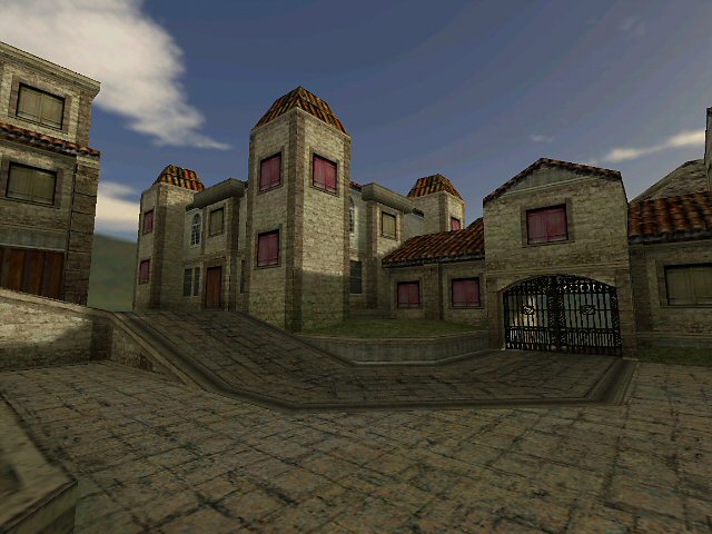
Sienna is Born
So, Aldea was nearing completion, but there were still some issues. One issue in particular was it’s name. I had originally got the name ‘Aldea’ by typing in a bunch of words into Google and getting the Spanish translations (such as ‘house’, ‘villa’, ‘road’ etc.) - then picking up the one I liked the most. I like Aldea because of the repetition of the ‘DEE’ sound - i.e., de_aldea. Alas, it was not to stay:
From: David Johnston
To: Jess Cliffe
Sent: Monday, March 29, 2004 11:57 PM
Subject: RE: New Aldea Build...Well where were we - Aldea or Camino? I’m not too bothered, but I like alliteration and short names, so Aldea does it for me :)
From: Jess Cliffe
To: David Johnston
Sent: Tuesday, March 30, 2004 09:16 AM
Subject: RE: New Aldea Build...I think we need to keep searching.…. For an even shorter, even more spanish name. Maybe we should forget the “Spanish word for _something map related_.”
My Spanish friend says aldea is pronounced alday-a .. Some would probably say aldeeeya. Therein lies the problem.
What about de_laguna?
Later...
From: David Johnston
To: Jess Cliffe
Sent: Tuesday, March 30, 2004 12:40 AM
Subject: RE: New Aldea Build...de_laguna is already taken (by a rather pretty and huge map) http://www.lanmaniax.com/maps/html/de_laguna.htm
My Spanish is non-existant, so if I forget that entirely I get: de_dash, de_dredge, de_dreck, de_amber, de_torrid, de_intense, de_sear
I rather like Intense and Dash.
Later...
From: Jess Cliffe
To: David Johnston
Sent: Tuesday, March 30, 2004 09:57 AM
Subject: RE: New Aldea Build...God, I need sleep. I had just played on laguna and said that. I meant to type: de_alguna ...
Dash might be too close to dust...
More...
De_sienna (I like that one)
De_sepia
De_terraOf yours, I like amber and torrid.
From: David Johnston
To: Jess Cliffe
Sent: Tuesday, March 30, 2004 1:11 AM
Subject: RE: New Aldea Build...Yeah, Sienna sounds fitting. I spose we just found a potential problem with Alguna :) But then, Alguna sounds good too.
de_alguna or de_sienna... hmm... de_alguna sounds better to me. Sienna seems too suggestive of a particular location.
From: Jess Cliffe
To: David Johnston
Sent: Tuesday, March 30, 2004 09:57 AM
Subject: RE: New Aldea Build...I think the best two are de_sienna and de_terra
My vote goes to sienna.
BTW, did I mention we’re shipping this map a week from today? :) That said, I need a final build by the end of day Friday. Is this doable?
From: David Johnston
To: Jess Cliffe
Sent: Wednesday, March 31, 2004 12:50 AM
Subject: RE: New Aldea Build...Friday is doable. As far as I understand, I have a couple of graphical bugs to fix up in the map, maybe the addition of some .mdl’s (if I can find out the names of them!) to make it all a bit more natural.
But whoa, didn’t expect it to ship that quickly!
From: Jess Cliffe
To: David Johnston
Sent: Thursday, April 1, 2004 10:01 AM
Subject: RE: New Aldea Build...All right, so let’s start bucking it down then. If you can get me a final build by eod Friday that would be great. Also make sure everything’s lowercase for linux, has 32 spawn points, etc etc.
Sienna! Sounds perfect :0
…and so Sienna was named, Cliffe got some sleep, and I got working. Hurrah! Incidentally, the last version I have of Sienna was saved that same afternoon at 4pm. So, not that much work, then.
The little things…
Often, you do things while designing that are so simple, so easy and so… well, unimportant and boring that you become more proud of them than the map itself. In Sienna’s case, the small things were the plants. Now, adding plants is easy - they’re just models. The tricky part was making them look good. I put them in the map, but they looked out of place - sometimes the origin was stuck into a brush and screwing up the lighting, and sometimes the join was too obvious and the plants looked like they were levitating. Look from the right angle and they were levitating.
The solution - HL ‘scorch’ decals placed at the base of the plant, which hide the join, add a simple sort of shadow, and made them look a lot better.
I told you it was simple and boring.
Done
In the days following, I tidied up the rough edges of the map - thing like odd lighting, places where a player or several players could get stuck, potential exploits and general neatening/beautifying. In some ways, it’s one of the nicest parts of the whole procedure - you know you’ve got a map, it plays well, and most of the remaining problems are cosmetic. But on the other hand, you also get to spot points of concern - high polygon counts and potential game play issues.
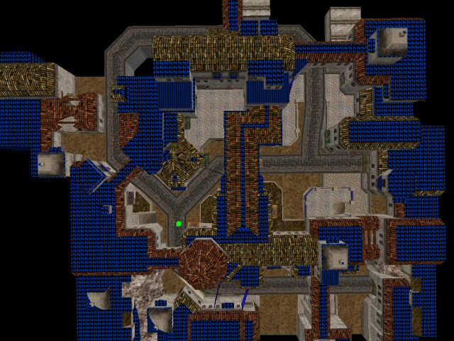
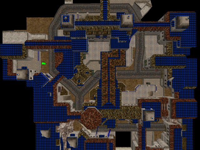
Polygon counts were the main beast here. At times the polycounts were as high as 800, which for most people, wouldn’t matter - some of the official CS:CZ maps had polycounts that high. The difference was that in Sienna, they occurred in a high-traffic area - the fork. Imagine about ten players plus a number of grenades being tossed each way, from site B down the ramp to the T spawn. Not nice.
The solution was less exciting - to simply go mad with hint brushes, remove details that were unnecessary, and keep recompiling with the maximum settings to get the polycounts as low as possible. I managed it, but at the cost of some luxuries, such as nice roofs and additional details which really helped the ambience.
Work Begins
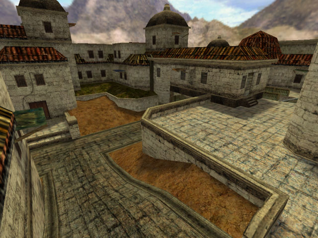
So, with my version of the map complete, the files went off to Valve for final touching up. And for this they got artist extraordinaire MacMan - Chris Ashton - to tidy up my mess of texture work and help give the map a more polished feel. The main problem was that I’m not an artist and I limited Sienna’s textures to a very basic set. Chris is an artist and could help expand the set, apply them, and add a whole lot more variety to the map. This helped give each ‘area’ it’s own identity and make them more instantly recognisable from a glance.
I’m glad he did. The final version looked superb compared to my last revision. I have no complaint with them making my work look better, none at all!
Then, one day…
From: Jess Cliffe
To: David Johnston
Sent: Thursday, May 27, 2004 22:38 PM
Subject: newsNews is out, d@ve:
Incidentally…
From: Jess Cliffe
To: David Johnston
Sent: Thursday, May 27, 2004 23:15 PM
Subject: RE: newsOh, btw, after play testing we moved the bomb site back to where you originally had it.
Dave killed cliffe with headshot from p228
Terrorists win!
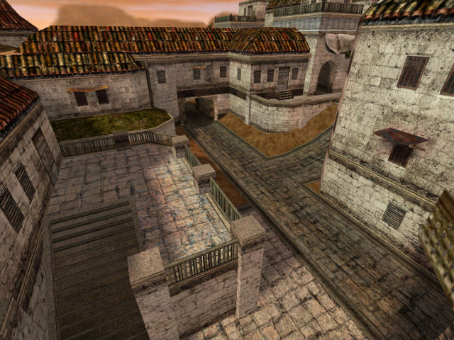
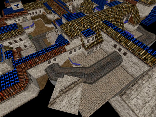
MacMan-ification
There’s a process that I’ve become increasingly familiar with - its technical term is ‘MacManification’ - whereby an individual named ‘MacMan’ spends hours away in a dungeon with your most prized possessions, then emerges with those same possessions, but improved by a factor that scientologists describe as ‘lots’.
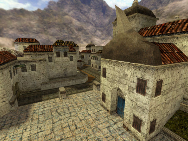
The best way to describe the result is through screen shots. On the left are screen shots of the original map and textures, and on the right are the renovated versions after they’ve been through the extremely complicated (and patented) MacMan-ification process.
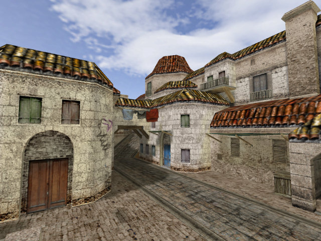
Interestingly, with the colour changes, it looks more like the Aldea of week 7 than my final version! You’ll see a bulk of the work involved replacing my textures with better ones, changing my bomb site signs with better (CZ-styled!) ones, as well as adding a fog, more red/brown hues (always good) and generally giving the whole place a real sense of atmosphere. I can’t thank Cliffe and MacMan (and not forgetting the rest of Valve) for the fantastic work they did.
Conclusion
After 12 pages, it’s about time I stop writing and actually publish this article…
Play Time
4 months after the release of Sienna, we can check on how it’s doing via map statistics, which are generally a good measure of how popular a map is, and sometimes an interesting indicator of the types of maps that players enjoy. According to these statistics by w00t.net and these by ServerSpy.net, Sienna is one of the least played official CZ maps. Of course, it was also one of the last to be released, but 4 months in, that’s negligible.
If I check my server browser… eight people are currently playing it. Seven of them are all bunched up on one server, while some one else is trying to enjoy a game of CZ by themselves. Good luck to them!
Who said statistics meant anything… interestingly though, it is the classic CS maps that are most popular in CS:CZ.
History Repeating
Looking back over the process of creating Sienna, it’s a classic ‘DaveJ’ story. Man opens up Worldcraft. Man empties brain. Something magical happens, possibly involving fairies, turning the noise into a coherent series of brushes and entities. Man releases map.
Sienna is a classic DaveJ map in other ways too - it’s rather compact, features brown, and set outdoors. But it’s also a little different - it is visually darker than Dust and Dust 2, contains less contrast, also a lot of height variation and tight areas where I’d usually prefer openness. In addition, it’s one of the few maps to feature textures that I made myself (who else would take a clean and tidy Victorian-style wooden door from the side of a University library and integrate it into some sort of dirty, smoggy middle-eastern town?)
The Good
As far as official CS:CZ maps go, I think Sienna is slightly unique in that it’s very easy for the outcome of the round to be decided within the first few seconds. It’s a very tight map and the teams start very close to the game play goals, and even those goals are closer together than one would normally find. There is a lot less running and more navigating around the map. The tall buildings are slightly overpowering.
What I do like about the map is the fact I got to play more with textures, and also got a lot of practice with a mapping style I’m not entirely used to. I’m a fan of open, sparse gameplay combined with very small areas of tight conflict - so Sienna was quite a learning experience. In the earlier builds I particularly liked the ambience - although it was obviously artificial, the feeling of seeing a map grow like that is tremendous.
But my favourite aspects of the map are simple - I like how it moves uphill (a nod to Avalanche and Avanti), how quick it is, and how tight it is.
The Bad
Unfortunately, the parts of the map I like make it less suitable for CS - the tightness of it doesn’t play well with most people, who find CS more entertaining with maps like Aztec, Dust and Italy - which feature large open areas as well as a nice balance of closed areas. Sienna weighs to heavily in the latter, and Sienna’s ‘open’ areas only seem open because the rest of the map is so tight.
One particular feature of the map I dislike is the entrance to the fork from the T start. The right hand side of the players view is blocked by a building and there is not enough cover from the left hand road up to site B. That area makes me feel uncomfortable as a player, although when making the map it seemed ok. However the visibility is not quite as ‘nice’ as I’d like it to be - according to my intuition, at least.
Site A is also too prone to rushing. Particularly, if Terrorists rush they have a very good chance of winning the round. If they don’t rush, then it’s still no easier to get to site B. The balance is not quite right - CTs guarding Site A can too easily see if Site B is under attack, even just by ear. It’s almost possible for one CT to guard both areas and still have time to defuse the bomb. There isn’t enough variety or space to make the map as exciting as it should be. Site B seems like it’s playing a bit-part, when it really should be taking a leading role.
Finally…
Overall, I’m happy with Sienna. It didn’t turn out precisely how I expected it to turn out when I started it back in February - I was expecting to end up with a map with larger spaces and more elbow-room, closer to Dust, Avanti and Romania (007:Nightfire) than Italy or Avalanche. I believe CS lends itself more to that sort of game play, but on the other hand, people often ask for maps that are far tighter and not the long-range shooting ranges that Dust and Cobble are. Having not made such a tight map before, I did learn a good few tricks - small things - to keep that sort of map interesting. The main and most well-known attribute is height differential - it adds a lot compared to everyone fighting on one plane.
If we look at aesthetics, I wish I could have got the map to look more like the original themed maps I did (see page 3), which borrows a lot from Dust and Italy, simply because I like lots of aspects of their appearance. Sienna feels a little ‘kludged’ or ‘rough’ to me (and it did from the beginning), but I couldn’t quite work out why. I’m fairly sure it’s my textures - which seem to emphasise the polygons rather than the environment - and lots of the bizarre architecture choices. There are a few different styles and themes all bunched up in Sienna that really don’t belong together - there are some clashing metaphors and some things just simply don’t belong, like the patterned wall trims and the tiled roads. I have a lot to learn in this respect, the first lesson being to remember to use reference photos and establish a proper theme next time, which I forgot in this round.
There isn’t much I’d change in Sienna - for a CS map, it’s alright, and I certainly can’t complain about the job Valve did to help bring it graphically up to par with the other CZ maps. I can’t help thinking that it should have been different - it was not quite the map I expected to make.