My request wasn’t a complete failure! I got screenshots! And pleas! And loads of exclamation marks! Whooray! I’ll do some today! Then some more in a few days time! I wrote too much today! Exclamation! etc.
Chuck ‘Chuck’ Wilson
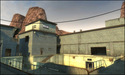
First off, the dim-witted Chuck Wilson, who mentioned in his e-mail, “feel free to rip in.” He sent a selection of ugly and distasteful screenshots to me, out of which I selected this one, which is a Source port (apparently) of the terrific HL1 map, ‘Crossfire.’ It nearly brought me to tears in its horrificness. I write this with paramedics on standby, just in case.
There are three distinct issues that I’ll address here. First and foremost, those bloody trims and tidy little edges beneath every little handrail. Especially the curvy one near the camera. Those can all go. All of them. They make the place look far too neat and pre-planned, whereas I always saw this area as buildings put together as the need arised. I threw up eleventeen times when I saw this. It really hurt.
Secondly, the mountains (or rock, or whatever those brown smudges are) in the background look so close I could throw my eleventeen buckets of vomit (with carrotty bits) all over them. The problem here is that you can make out fine detail in the texture, and apparently there is no atmosphere on the day the photo was taken; in the real-world there would be some sort of very light blue-ish white silverish haze (i.e. fog) which give the impression of depth. At this point I considered cutting out my own eyeballs in horror, when I saw a butterfly and chased it around my lounge for two whole hours… happy times…
Thirdly, as before, it does look all a bit too planned. There should be more variation from the grey brickwork - perhaps just the building on the right half of the screenshot could be made from concrete, indicating significance since (if I remember correctly) that building goes out onto the no-mans-land bit. Perhaps a little more to break up the skyline - the mountains help, but I can’t help think it needs some machinery or something. Maybe a flag, or a hippo on a stick. Summat like that would do nicely.
Kevin Anderson (The Wise)
Next, the delighftul Kevin Anderson, who - in a drunken stupor - forgot to send me any screenshots at all, until I pointed out the minor flaw in his otherwise water-tight plan. Genius. He shall henceforth be known as Kev The Wise.
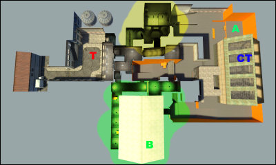
Above is the overview of Kev The Wise’s map. Now, it doesn’t look too bad, to be honest. A slight attack of corridorexia in the middle, and the CT side could possibly use more height variation (there are lots of opportunities) but it’s looking ok for such a young map.
A couple of areas do concern me - note the yellow blob and the green blob. Given the position of the team spawns and the two bomb locations, the yellow blob area looks like it would end up fairly redundant, by which I mean it could be removed and most players would be happier without it. Secondly, bombsite B (green blob) feels ‘distant’, and I’m not entirely sure what’s inside it…
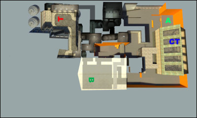
I’d do something like this:
(Apologies for the headache inducing change of perspective and numerous errors, but the general principle is there at least!) This brings the Terrorists fairly equidistant from both bomb spots, brings their focus further to north/A, and makes bombsite B more interesting. B would work fairly well as a 2-level warehouse bomb spot (flooded with pretty sunlight - hooray!) if it had lots of cover.
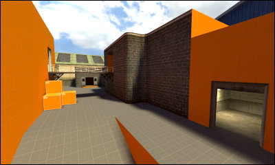
Kev The Wise also sent along this shot:
A few things to note here. Firstly, the curve in the brick wall has gotta go, it doesn’t work. Secondly, when you already have loads of assets available to you (i.e. crates and such), there is little reason to use orangewall placeholders. I dare say placing an actual prop is a lot easier than making and texturing the placeholder brushes.
Thirdly, the walkway seems purposeless. By which I mean it obviously has its purpose in the game, but in real-life a walkway would not exist like that; it would be given a secondary purpose other than letting people go between two buildings, and it certainly wouldn’t have a huge hallway-like entrance at each end. It seems fake. What might work better would be a long platform all the way along the left wall, with a smaller, thinner walkway connecting that platform to the building on the right. Something to give the impression of an afterthought. Maybe changing the heights and sizes of the entrances at either end would help further this idea. Nothing is ever perfect.
So, good effort, Kev the Wise! I’d suggest a few alterations, but keep steaming ahead. Just keep your eye on the architecture here and there to stop it becoming too ‘convenient’.
Ryan ‘Blitzkrieg’ McGlynn
Finally, Ryan is at work on his first non-aim map, for CS:CZ (judging by the textures?)
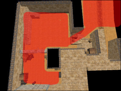
The map is clearly in very early stages, as the overview shows. Already the map is becoming a little disjoint, with the left-hand area a little empty and lifeless - it’s basically a square area with 3 entrances. It is the essence of an arena, in its most-basic form. The whole left-side should be expanded and populated, to give it reason and purpose.
For example, consider the CT start of Dust. This is, in its basic form, a rectangular room with two doorways and a slightly-elevated platform (the bomb and spawn area.) However, it’s been made bigger than this to accomodate a couple of buildings, perimeter huts, and changes in the height of the area. It could have been a lot smaller, but that would have been fairly dull and uninspired. The same applies here - this area simply needs to be expanded and made more inviting, more real.
Secondly, you can consider this an overview of two logical areas - one on the left and one on the right. Usually two ‘largish’ areas would be disjoint, that is, there would be no (or a very thin) line of sight between them; a player in one area would be unable to shoot directly at a player in another. The connecting section should be lengthened to enforce this.
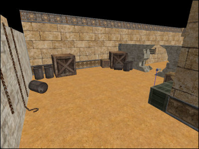
Above is the CT start, showing ropes over a wall and then a hole through a second wall. Immediate thing that concerns me here is the texture choice of the two white-ish walls, they just don’t mesh well with the brown wall opposite. Secondly, why would CTs need a hole in the wall if those crates and barrels weren’t so conveniently placed?
What I would do is change the white wall on the left to be the same brown+trim as the opposite one, showing a break in the wall at the very top where the CTs have leapt over into the playable area. The broken wall would become a simple ‘Dust Arch’, if only so it matches the height of the long brown wall. As a spawn area, it also seems very small and cramped, ideally I’d go for something several times this size to make it more defendable and a more likely insertion point.
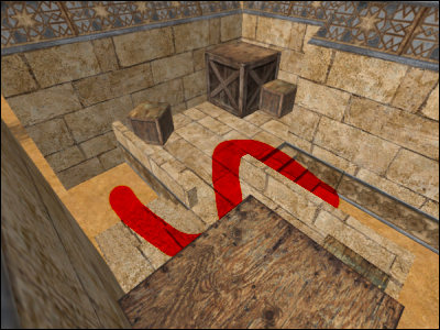
This is an interesting one. Basically, this is a small platform with two sets of steps either side, in an ‘S’ shape. The expected path is to walk up the steps, turn left to face the other direction, walk forward, turn right round again, and down the other steps. No sane player is ever going to do this, and that’s why you don’t see this very often. Of course, the player could jump, but this becomes an obstacle that shouldn’t exist.
A far more sensible approach would be to line up both sets of steps so the player doesn’t need to turn around at all, or to lengthen the platform area and move the steps a long way along, closer to the road. This could be part of disjoining the two areas, hence killing two birds with one stone, although less cruel.
Anyway, a good start, just needs some direction and more consideration over how areas connect.
Apologies
This is the bit where I say all opinions expressed are my own, are not intended to cause offence, harm or injury and any ideas should only be attempted by responsible adults, or stupid ones. Whatever makes the best video, really.
More next time!
