Much later than I anticipated, so I’m gonna get this up and posted while I can. I’ll do the final one next week now (hopefully…) then normal service can resume. Probably.
Paul ‘Neat and Tidy’ Schmur
This map is called de_parkade. Good start.
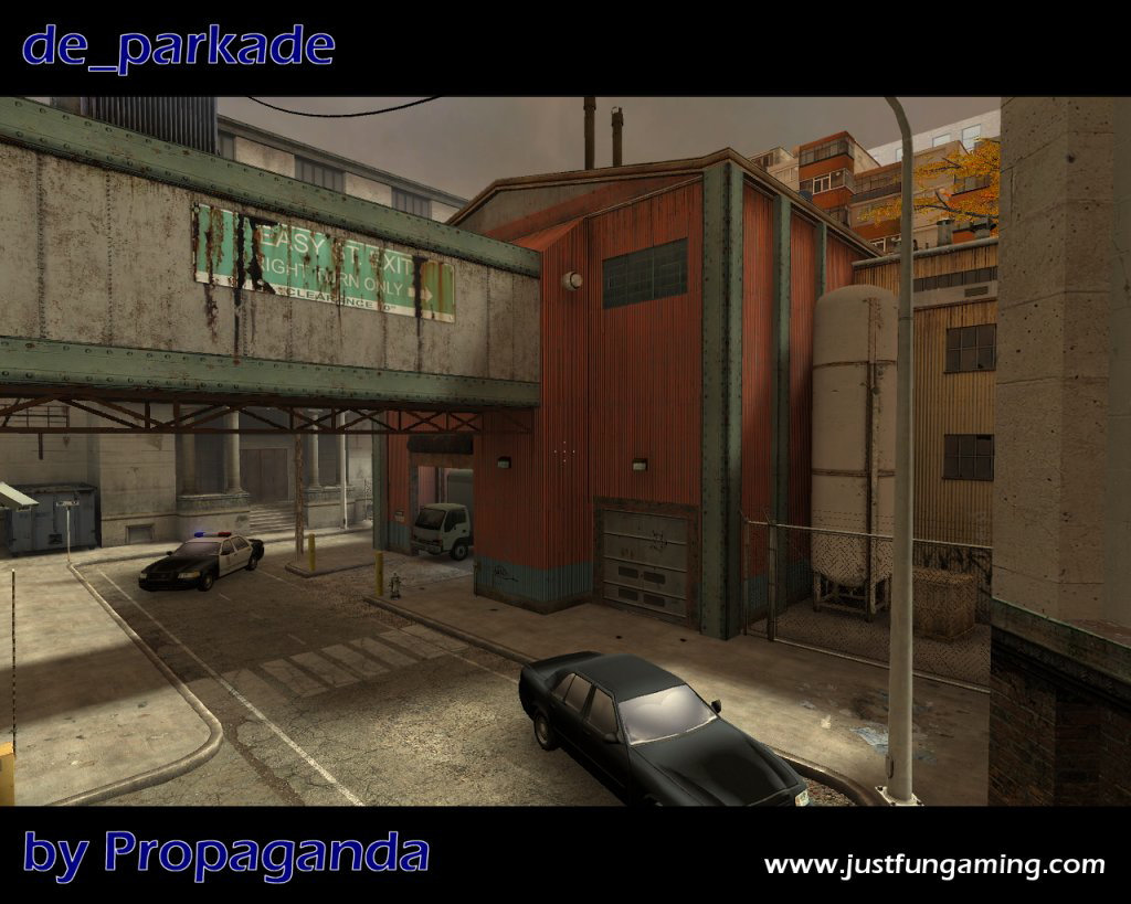
First impressions: it looks good. Second impressions: not so good.
I’ll cut to the chase: it looks fake. I can’t put my finger on it, but there is definitely something funky going on here. Maybe it’s just the multitude of colours or the compactness of it all; I can’t quite work it out. It reminds me a bit of last-generation HL1 maps, where everything seems so neat and tidy, but this has a neat-grubby feel. It looks dirty, but doesn’t feel dirty. The big red warehouse stands out a lot. The roads are very narrow. It all feels confined.
The crosshair though, I like. Brilliant!
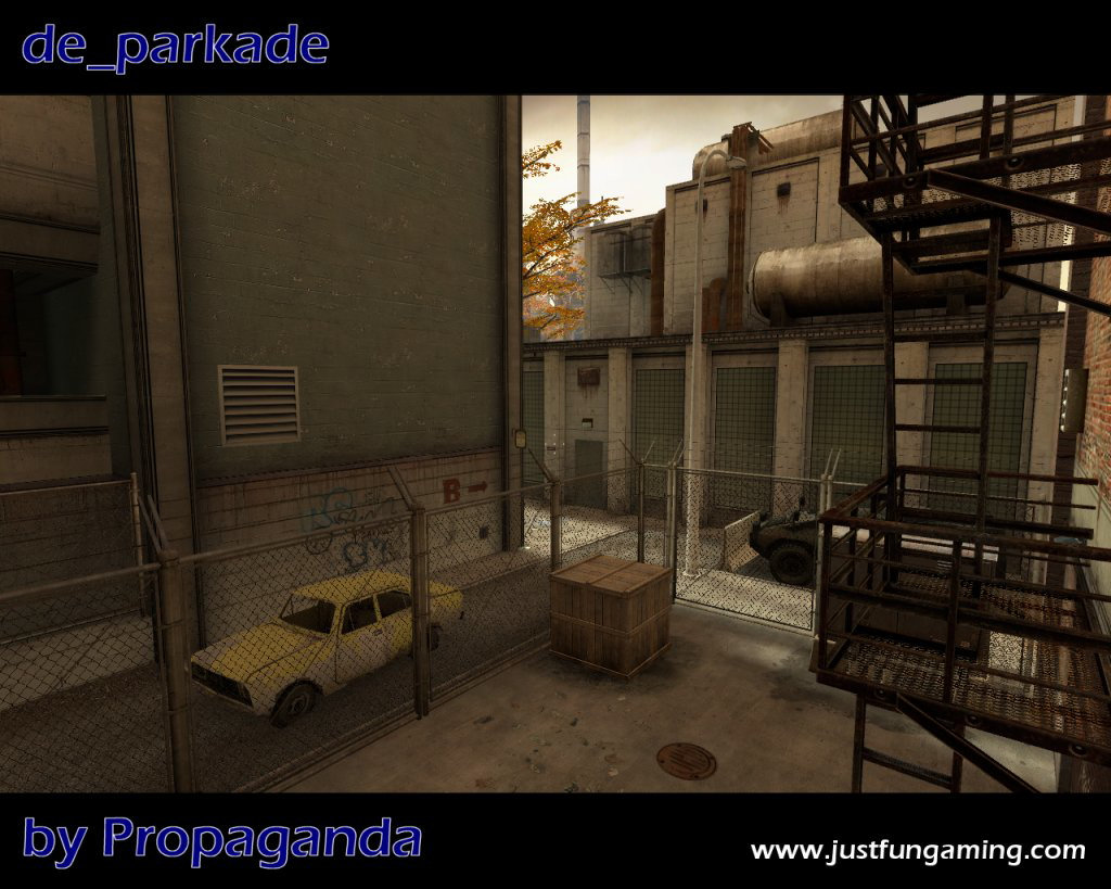
This one is better. Again, it feels really cramped, and unless the player can get to the area on the right, there’s very little height variation. Gameplay here will be very restricted, but I have a feeling it’s a spawn area so that shouldn’t be too bad.
It does look good though - especially the Nuke-ish building on the right-half of the screenshot. As I type this, the weather outside is a pretty good match for the lighting in this shot, so it feels much more convincing!
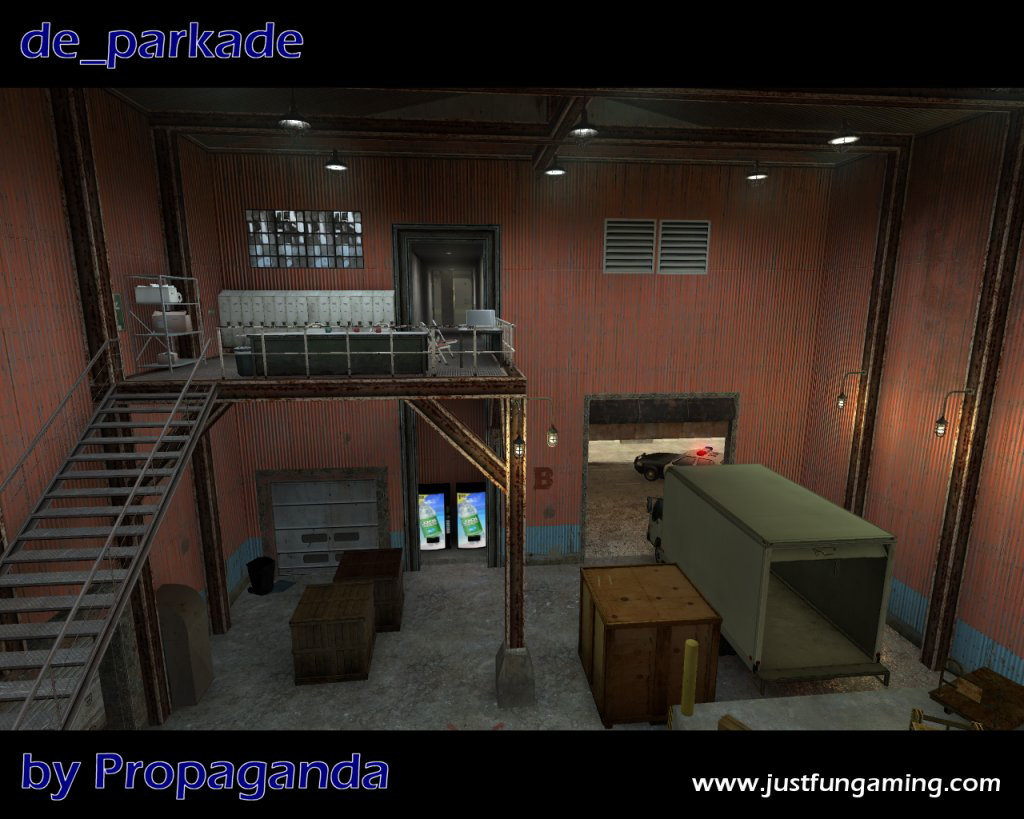
Something about this area seems wrong to me. Maybe it’s too well lit, too evenly lit, or too adhoc or something, but it just feels wrong. The twin vending machines can probably go. The platform looks fake. An area like this is always hard to design for due to the huge change in height and the tall platforms, but I think in this case it could be used a lot better.
There’s a good opportunity to extend the catwalk so it goes further towards the camera, giving a better view of the entrance. This would also make better use of the available headroom in this one little building. Also, adjusting the lighting would work wonders - we’ve got a whole multitude of light sources here competing for the same job when all we really need are a couple (sunlight if possible, and a couple normal lights.)
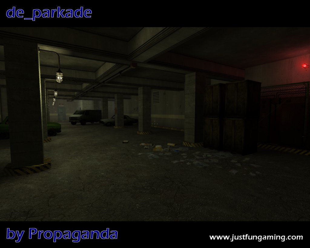
This follows the same trend as the shots above - neat (but grubby), and very very tight and enclosed. In my experience, this sort of style doesn’t work well for CS maps, where we have a medium-sized area of tight and enclosed areas with little coordination between them, but I know for a fact there is a good audience for exactly this style. When I play maps like this, I always feel a bit disconnected from the action, whereas with simpler, more open maps I feel like I can’t escape it.
Overall, this does look like a good piece of mapping, although I’m still unsure about the design. It seems a bit neat and overdone in places, missing out on a few little tricks to make the gameplay more interesting. That said, it’s one of the better looking Source maps with some definite hints of HL1/CS1.6 in there as well, which is nice.
Ronaldism
First thing I should mention is that the small screenshots below have been tweaked. Click on them for the originals. It might be wise to wear sunglasses. The sunlight desperately needs to be toned down, a lot, if only to remove the blotchiness…
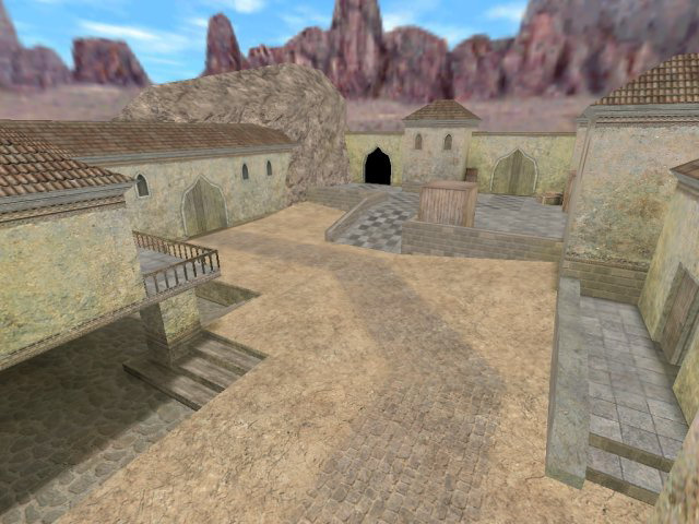
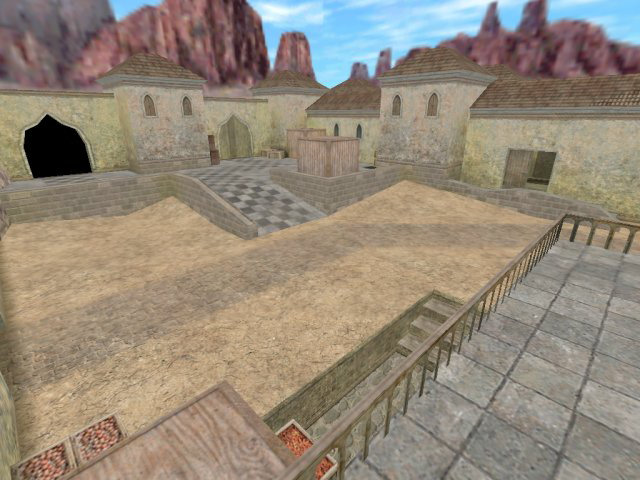
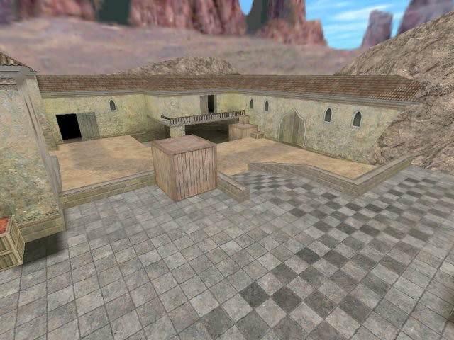
This is an example of a very open map - we have a vast area here which (fortunately) has some variation in height across it. In this respect it’s very much like Dust - simple texture set, simple architecture, simple overall design. The key with Dust maps is to make sure that the entire area is used and that players don’t find themself wall-hugging loops around it.
Apart from the garish lighting, the texture set looks ok. There seems to be some confusion over what this place is - note the raised area appears to have marble checkered floor, it’s surrounding walls are made of hard-edged, grey brick, and the rest of the environment is a mix of stone, sand and plaster. There’s a lack of consistency in this respect.
With this sort of map you also have to consider the path the player would ideally like to take. Generally, try to avoid forcing the player to take a long path around an obstruction which offers them no protection. Consider the raised area above: the only way up is via the ramp, I don’t think they can jump up the surrounding walls as a shortcut. It’sd be worth adding some shortcut so they can jump up.
This concept works both ways - if someone has to take a long route instead of dropping down somewhere, just to avoid damage, it can hinder the gameplay. This is especially true in Dust and Dust 2 - if you die, chancesw are you got shot, rather than falling off a ledge. It’s the reason why big drops (like the Terrorist start of Dust 2) have crates and other platforms so the fall is staggered.
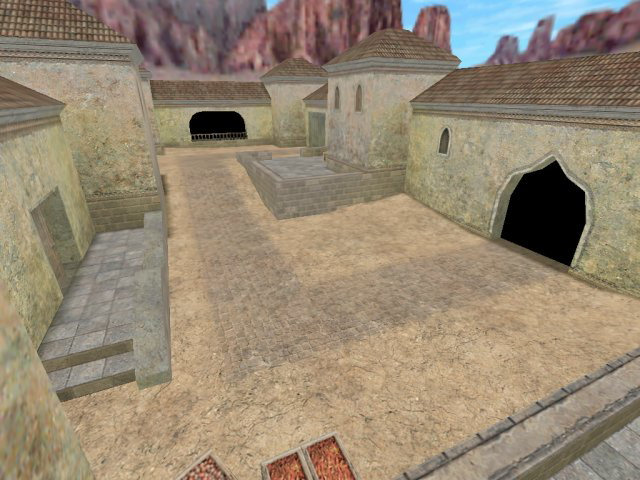
There’s some dubious, square geometry here. The roofs might look pretty, but the road sits at right-angles (that’s so 2002), and the small set of steps on the left looks blocky and and simple. It really needs some additional detail and tweaks to make the environment seem less flat.
Overall this map is pretty basic and obviously in early stages, which means it’s the perfect time to work out how to pump more life and variation into it. It needs some sort of focus, be it a landmark or a change in scenery, just to hold it together and stop it seeming like a collection of identical buildings… just more architectural variation would be nice. Better lighting too. Yes, I am taking into consideration it’s CS1.6 and not this crazy new ‘Source’ stuff. It could be a lot better.
Finally, SiN Episodes: Emergence was great.